Branding: Boys and Girls Country Spring Festival
CHALLENGE: Boys and Girls Country (BGC), a non-profit Christian home for boys and girls from homes in crisis, had struggled with the branding for their annual fund-raiser for several years. A different theme each year, with its own graphics and slogan, confused their current and potential supporters, rather than promoting BGC and publicizing their spring festival.

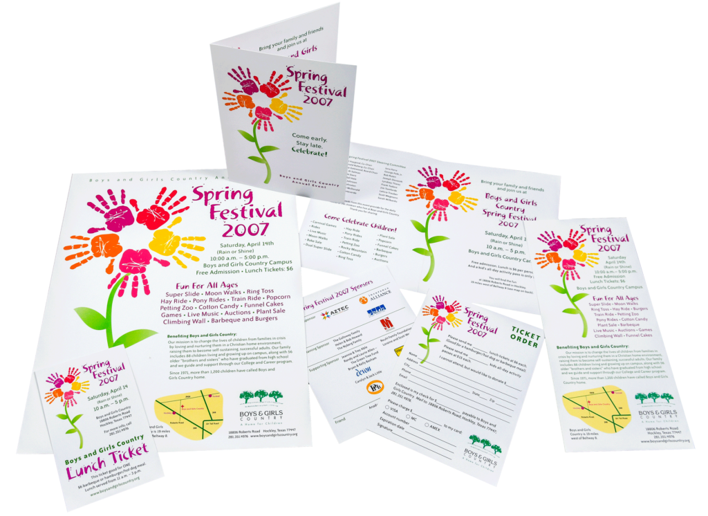
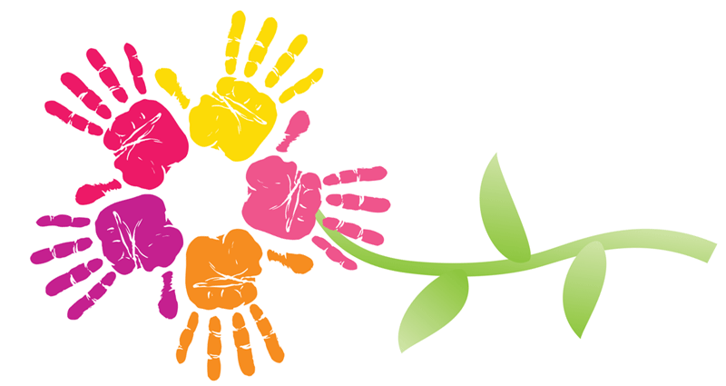
STRATEGY: Neos Marketing and Claudia Herring Design decided that BGC needed an identity designed for the Spring Festival that would firmly brand it as the BGC annual fund-raiser. It needed to be fun, creative and address children and growth. Handprints in paint represented the boys and girls, and, when formed into a flower, this became the perfect logo for their spring festival. This logotype with a fun, free look was developed to complete the branding.
RESULTS: BGC now had a clear identity and branding for their Spring Festival. The logo and logotype was used on all the campaign and publicity materials: flyers, ads, invitations, envelopes, lunch tickets, envelope stuffers, maps, email masthead, raffle tickets and ticket